|
|
 |
|
|
| NOTE: This Design document is subject to change at any time. |
Syntax: <TABS property-list>tab-list</TABS>
This control implements a list of "Tabs". Unlike the zPages control, there is no separate panel associated with these tabs. The Tabs control is simply the list of tabs and can be used when you want more control over what happens when you click a tab (rather than just switching to a different page like the zPages control).
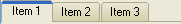
Each tab is specified using the <TAB> tag. For example, the above picture was created with the following code:
| Code: |
<TABS align='top'>
<TAB caption='Item 1'/>
<TAB caption='Item 2'/>
<TAB caption='Item 3'/>
</TABS> |
Unlike other zApp controls, the Tabs control does not respond to changes in the current theme. Instead, properties are provided to give more direct control over the look and feel of the tabs. This allows features such as colored tabs that are not supported by Windows themes.
Since the Tabs control shares the same properties as the Pages control, see the zPages documentation for property details. |
|

 ItemSep