|
|
 |
|
|
| NOTE: This Design document is subject to change at any time. |
Syntax: <PAGES property-list>pages</PAGES>
The Pages control implements a collection of "Page" components, each page having it's own "tab". This is typically used for option and property screen where multiple pages of options need to be displayed.
If you need to display a set of "tabs" without needing a separate panel for each tab, see the zTabs component.
Unlike other components in zApp, the Pages component doesn't implement themes normally. Rather than letting the theme control how the tab page is displayed, the page control implements several properties and methods to override the default look and feel. In particular, the Pages control allows you to set a different color for each tab, and better control whether the border around the pages is displayed.
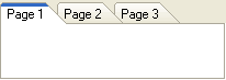
Within a Pages control, you will need to define each separate tab page using the <TAB> or <PAGE> tag (both are equivalent). For example, to create the image shown above, the following code was used:
| Code: |
<PAGES>
<PAGE caption='Page 1'/>
<PAGE caption='Page 2'/>
<PAGE caption='Page 3'/>
</PAGES> |
For details on the properties that can be set for each page, see the zPage component.
The OnClick event is called when a tab is clicked. The OnCloseQuery is called to determine if a tab can be closed when clicking the Close button (if ShowCloseButton is true). Use the TabIndex or ActivePage properties to determine which tab was clicked or closed. |
|

 ItemSep