 |
Zugg
MASTER

Joined: 25 Sep 2000
Posts: 23379
Location: Colorado, USA
|
 Posted: Sun May 14, 2006 1:33 am Posted: Sun May 14, 2006 1:33 am
New Preferences Screenshot
|
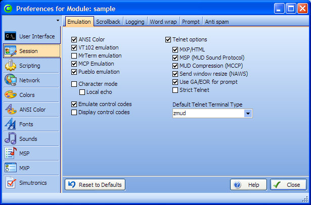
One of the things I'm doing with CMUD is making it easier for novices and less intimidating. Part of that work is with the Preferences. The Preferences screen in zMUD can be very intimidating for first-time users, and there are many options that are old and really aren't needed anymore.
So, I've been streamlining the Prefs screen in CMUD, removing un-needed options and moving things around a bit so it makes more sense. I'm sure it will take a few iterations during the beta to get this tweaked just right.
Anyway, I took a screenshot of the new Prefs dialog just to give you a preview:
 |
|
|
|
 |
shalimar
GURU

Joined: 04 Aug 2002
Posts: 4691
Location: Pensacola, FL, USA
|
 Posted: Sun May 14, 2006 2:40 am Posted: Sun May 14, 2006 2:40 am
|
Oooooo... Spiff
|
|
_________________
Discord: Shalimarwildcat |
 |
|
 |
bortaS
Magician

Joined: 10 Oct 2000
Posts: 320
Location: Springville, UT
|
 Posted: Sun May 14, 2006 3:28 am Posted: Sun May 14, 2006 3:28 am
|
Ooooooooo is right!
That's probably the best settings presentation I've seen in a while. |
|
_________________
bortaS
~~ Crusty Klingon Programmer ~~ |
 |
|
 |
edb6377
Magician

Joined: 29 Nov 2005
Posts: 482
|
 Posted: Sun May 14, 2006 3:37 am Posted: Sun May 14, 2006 3:37 am
|
Yeah there are quite a few options that could have been poofed a long time ago. Glad to see you are taking a bit of time out to remove those and add in any new ones that are needed :)
|
|
_________________
Confucious say "Bugs in Programs need Hammer" |
 |
|
 |
Rainchild
Wizard

Joined: 10 Oct 2000
Posts: 1551
Location: Australia
|
 Posted: Mon May 15, 2006 6:14 am Posted: Mon May 15, 2006 6:14 am
|
Pr0n! Very nice indeed. I especially like the fadey background theme thing.
|
|
|
|
 |
edb6377
Magician

Joined: 29 Nov 2005
Posts: 482
|
 Posted: Mon May 15, 2006 7:06 am Posted: Mon May 15, 2006 7:06 am
|
yeah the gradient background is nice.
|
|
_________________
Confucious say "Bugs in Programs need Hammer" |
 |
|
 |
Larkin
Wizard

Joined: 25 Mar 2003
Posts: 1113
Location: USA
|
 Posted: Mon May 15, 2006 2:05 pm Posted: Mon May 15, 2006 2:05 pm
|
I love the new layout, too. One tiny question, though: is the color scheme for the dialogs configurable? Can we make it all dark and gloomy or silver and sparkly or pink and fruity? (I'd go for the first option before the last option.  ) )
|
|
|
|
 |
Zugg
MASTER

Joined: 25 Sep 2000
Posts: 23379
Location: Colorado, USA
|
 Posted: Mon May 15, 2006 5:20 pm Posted: Mon May 15, 2006 5:20 pm
|
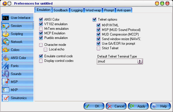
CMUD supports zApp themes. Any WindowsXP *.msstyles file can be loaded. These files can be converted to a smaller *.theme file by a utility over in the zApp download area, and there is a skin designer (3rd party, a bit buggy, and unsupported) in the zApp download area for creating and editing *.ksdn skin files that can also be loaded.
Not all of the theming support is perfect in CMUD yet, and I'm leaving that tweaking until a later time.
The theme shown in the screenshot above is the built-in "OfficeXP" theme that is the default for CMUD. |
|
|
|
 |
Zugg
MASTER

Joined: 25 Sep 2000
Posts: 23379
Location: Colorado, USA
|
 Posted: Mon May 15, 2006 5:48 pm Posted: Mon May 15, 2006 5:48 pm
|
Here is the same screen in CMUD with the internal "Aqua" theme selected:
 |
|
|
|
 |
Belmyrddyn
Magician
Joined: 17 Oct 2001
Posts: 371
Location: USA
|
 Posted: Mon May 15, 2006 6:55 pm Posted: Mon May 15, 2006 6:55 pm
|
Yay! I was a little worried that Simutronics support would get dropped - I couldn't remember if you said you were going to carry it over.
Also - I'm a little sad that we got a preview of the CMUD logos. I was waiting for the beta launch. Although the little corner icon does look great. :) |
|
_________________
Belmyrddyn |
 |
|
 |
Rainchild
Wizard

Joined: 10 Oct 2000
Posts: 1551
Location: Australia
|
 Posted: Mon May 15, 2006 10:33 pm Posted: Mon May 15, 2006 10:33 pm
|
I would say that there will be the uber logo still to be revealed - you know, like the castle with the lights, I imagine Zugg's got something else in mind?
Maybe something like:

3d Rendered by Eric "Knight" Holbrook
You could still get the lights in the castle, but you could also clicky and have the dragon breathe fire! Now that would be a spalsh screen... |
|
|
|
 |
Zugg
MASTER

Joined: 25 Sep 2000
Posts: 23379
Location: Colorado, USA
|
 Posted: Tue May 16, 2006 3:47 am Posted: Tue May 16, 2006 3:47 am
|
Not bad Rainchild, but I think you'll like the CMUD splash screen even better. Also, of course, I couldn't use any licensed images. I love your dragon picture, but I'm assuming it's copyrighted. I couldn't find any decent dragons that weren't.
But if this image isn't copyrighted, send me a URL for it.
And yes, the little "C" icon in the upper-left slipped in by accident...oh well, a small taste. But the main splash screen is totally different than the old "castle" image. I've gone in a completely different direction  |
|
|
|
 |
Rainchild
Wizard

Joined: 10 Oct 2000
Posts: 1551
Location: Australia
|
 Posted: Tue May 16, 2006 4:40 am Posted: Tue May 16, 2006 4:40 am
|
The image is created by Eric "Knight" Holbrook - so copyright to him. His website is www.deepdarkdigital.com and he has a lot of 3D rendered images (some not safe for work, but the vast majority are landscapes and such).
He does license images for commercial use, as well as non-profit use (eg he gave me the OK to use images for my MUD's website), and he has done 'custom-to-order' images in the past too... no idea what he charges for that tho. |
|
|
|
 |
Zugg
MASTER

Joined: 25 Sep 2000
Posts: 23379
Location: Colorado, USA
|
 Posted: Tue May 16, 2006 4:54 am Posted: Tue May 16, 2006 4:54 am
|
Well, since the CMUD graphics is already done and I'm already happy with it, I'm not going to worry about it right now. Typically the charge for images like this in commercial products is quite high (usually several thousand). To create the CMUD graphics, I joined a Stock Photo site and did my own editing. I'm quite pleased with the results and I won't have any copyright issues. I can use the images I put together for advertising CMUD, t-shirts, etc without any additional license fees. Since I'm poor right now, the cost of the images was important.
Back in October I contacted a local graphic arts studio to do just the logo, and they wanted $600 just for the 32x32 logo. Obviously the big splash screen was going to be *waaaay* too expensive, so I never hired them. I did the CMUD logo stuff myself too. It's amazing how much graphic artists charge. I understand how much work is involved, but my problem has always been that I don't want to pay until I see something I like. I'm *really* picky about what I like and what I want and didn't want to shell out a lot of money and then get something I was disappointed in.
At least with the current graphics, I only have myself to blame :) But I still think it turned out nice.
But thanks for the link. Holbrooks stuff is definitely nice and I'll keep him in mind in the future. |
|
|
|
 |
Riesz
Novice
Joined: 16 May 2006
Posts: 35
Location: Plymouth, England
|
 Posted: Tue May 16, 2006 10:11 am Posted: Tue May 16, 2006 10:11 am
|
Looking very nice there. When I first came to zMud, I was prtty new to MUDs in general, and was hella confused by the myriad of options (despite being quite computer literate). Slimming down on out of date options will be most helpful for the first timers, less hassle for the experienced, and generally neater all round. Good work!
Pretty dragon picture too by the way, definately a site for me to look through (though I'll leave it until I've left work :p) |
|
_________________
Elaria, Lusternia. |
 |
|
 |
bortaS
Magician

Joined: 10 Oct 2000
Posts: 320
Location: Springville, UT
|
 Posted: Tue May 16, 2006 2:33 pm Posted: Tue May 16, 2006 2:33 pm
|
Zugg,
I use Design Outpost ( http://www.designoutpost.com/ ) for most of my logos and stuff. It's basically artists competing for the money pot you pony up. I've only had to put up between $100 to $120 per logo. I don't bother with icons, since I have some very nice icon editing tools. I use Axialis Icon Workshop ( http://www.axialis.com/ ) for the icons. |
|
_________________
bortaS
~~ Crusty Klingon Programmer ~~ |
 |
|
 |
Rainchild
Wizard

Joined: 10 Oct 2000
Posts: 1551
Location: Australia
|
 Posted: Tue May 16, 2006 10:43 pm Posted: Tue May 16, 2006 10:43 pm
|
Neat site bortaS, I knew there was one for auctioning jobs off to programmers, but didn't realise there was one for artists too.
I always have some image or other from deep dark digital as my wallpaper - that's what he started as, rendering wallpapers... used to charge for the high rez ones too so I bought a lifetime subscription hehe.
I'm not really surprised graphic companies charge so much, I mean our company bills my programming time out at almost $200 an hour, and when you consider an icon is probably going to take 1/2 a day, perhaps longer if you go 'well I don't like this, and can you change that'... so $600 is one hand a lot, but on the other it's a bargain...
I think the 'cheap' way is to get an artist on staff, but that's really only going to work in a company who already has several developers and a large income. |
|
|
|
 |
slicertool
Magician

Joined: 09 Oct 2003
Posts: 459
Location: USA
|
 Posted: Tue May 16, 2006 11:28 pm Posted: Tue May 16, 2006 11:28 pm
|
| Rainchild wrote: |
| I think the 'cheap' way is to get an artist on staff, but that's really only going to work in a company who already has several developers and a large income. |
Nope, the cheap way is to date an art major. Trust me, I've dated 3. |
|
|
|
 |
|
|
|
