|
|
 |
|
|
| NOTE: This Design document is subject to change at any time. |
Syntax: <EDIT property-list>buttons</EDIT>
Use the zEdit component for a text input box. In it's simplest form, an input box is created that the user can enter any text value into. There are several properties that allow you to set a "mask" for the user's input to control what text entry format is allowed. You can also add buttons to the right side of the edit box, and can add a caption to the edit box.
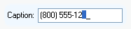
The Text property is used to set or retrieve the value of the edit box. The Caption property is used to set the label attached to the edit box (to the left of the box by default). Remember that setting the Align property will ignore any caption. So, to display the caption after using Align, use the DeltaLeft property to increase the left edge by enough to see the caption.
The Mask property can be used to specify an input mask to limit what the user can enter into the text box. The MaskType property determines the format of the mask and allows you to set simple masks, or use complex regular expressions for the edit mask.
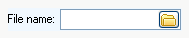
To add buttons to the right side of the edit box, use the normal <BUTTON> tag like this:
| Code: |
<ACTION Name='FileOpen' Action='_FileOpen'>
<EDIT Name='Filename' Caption='File name:'>
<BUTTON Image='folder' action='FileOpen'>
Filename.Text = FileOpen.Dialog.Filename
</BUTTON>
</EDIT> |
would create an edit box that looks like this:
 |
|

 Insert