|
|
 |
|
|
| NOTE: This Design document is subject to change at any time. |
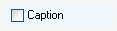
Syntax: <CHECKBOX property-list/>
Creates a checkbox control. This is the same as the CHECK.BOX subclass.
Normally a checkbox has two states: checked and unchecked. If AllowGray is set, then an additional "gray" state is allowed. The various Display* properties control what is displayed for this checkbox when used in a grid and exported, or when a text value is needed for the checkbox. The various Value* properties control the actual values returned from the checkbox for the various states (in the Value property). The Checked property always returns true or false.
This single check box can be assigned to a database field via the DataSource and Field properties.
Several subclasses are also available: CHECK.GROUP, CHECK.LIST and CHECK.COMBO. |
| User comments |
| Castaway: Wed Aug 10, 2005 5:05 pm |
|
The "Checked" property is actually called "State" according to the property list (or its not listed for some reason).
C. |
|
 |
| Zugg: Mon Aug 15, 2005 4:03 pm |
|
| Actually, the "Checked" boolean property is also supported. The "State" property is used when a 3-way checkbox (with the Grayed option). If the Checked property isn't working, please report that as a bug in the bug tracking system. |
|
|
|



 AllowGrayed