|
|
 |
|
|
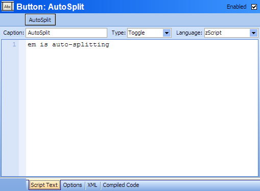
When you select a Button setting you will get an editor panel like this:

- Enabled
- Determines if this button is enabled or disabled.
- Name
- This is the name of the button. This is the text that you want to appear as the caption for the button. Any variables or functions in the name are expanded before being displayed on the button.
- Type
- This is the type of the button. The different button types are explained below.
- Script
- This is the script executed when the button is clicked. See the Scripting topic for more information.
- Language
- Select the scripting language used for this button. Built-in languages include: zScript, Lua, VBScript, and JavaScript. But any other scripting language installed into the Windows Scripting Host can also be used.
- Script Text / Options / XML / Compiled Code
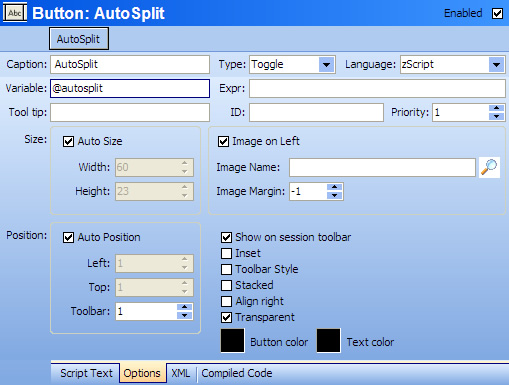
- Clicking on the Options tab will display the options panel for the button editor:

Selecting the Compiled Code tab will show the low-level code generated by this button. This is for internal testing purposes and is not documented further. Selecting the XML tab will allow you to edit the raw XML data used for copy/paste and import/export.
- Variable
- This is the name of the variable (the @ character is optional) which will contain the value of the button. When a Toggle button is pressed, the value is 1. When a Toggle button is unpressed, the value is 0. When a multistate button is used, the variable is set to the currently selected button state. If a script changes the value of this variable, the button will change to the corresponding state as if it were clicked by the user.
- Value
- Specifies an expression to determine the current button state. This can be used to control the button state via a complex expression. For Gauges, this represents the value displayed by the graphical gauge.
- Tool tip
- This is the text displayed when the mouse hovers over the button. Any variables or functions within this text are expanded when the text is displayed.
- ID
- This is the shortcut name assigned to reference the button. Normally buttons are referenced by number (their priority number). Use the ID field to refer to a button by name instead of by number.
- Priority
- This specifies the order of the buttons on the toolbar. The Priority number is also used to reference the button by number in various button functions.
- Auto Size
- If checked, the size of the button is determined by the global default button size Preferences
- Width
- Sets the width of the button when AutoSize is unchecked.
- Height
- Sets the height of the button when AutoSize is unchecked.
- Auto Position
- If checked, the button is automatically positioned to the right (or below) the previous button.
- Left
- The position of the left edge of the button when AutoPosition is unchecked.
- Top
- The position of the top edge of the button when AutoPosition is unchecked
- Toolbar
- Specifies which of the 4 button bars the button is placed on. The location of each button bar is specified in the session Preferences.
- Image on Left
- Determines if the image is displayed to the left of the text or above the text.
- Image Name
- Specifies the name of the image to be displayed on the bottom. The browse button can be used to select an internal image that is available for all CMUD users that might share your package. You can also specify an external filename for the image, but if you distribute your package to other users then you will also need to provide them with your image file.
- Image Margin
- Specifies the spacing between the image and the text. The default of -1 will center the image and text on the button
- Show on session toolbar
- Determines if the button should be displayed on the button bar. All buttons are also available as menu/toolbar items via the Customization feature. If the button is only intended for a customized menu/toolbar, then select this option to remove the button from the normal session buttonbar.
- Inset
- Display the button as if it were inset within a frame.
- Toolbar Style
- If this option is set, then the borders of the button are only displayed when the mouse hovers over the button.
- Stacked
- If this option is set, then the button is stacked under the previous button, rather than being displayed to the right of the previous button.
- Align right
- Displays the button on the right edge of the button bar instead of placing it after the previous button
- Transparent
- The button is displayed transparently (the button color is ignored)
- Button color
- Sets the background color of the button
- Text color
- Sets the color of the text on the button.
Button Types
Buttons can be nested within each other to form multi-state buttons. For example, a Toggle button has Two button states (On and Off). Each state is represented by a seperate button object. The main button sets most of the button properties (size, position, etc). The substate can specify a different caption, script, and button color.
- Push
- The default button type which only has a single state. The script is executed when the button is clicked. The button does not stay down...it is a momentary push button.
- Toggle
- Toggle buttons have 2 states (off and on). The Off state is the main button state. The child state can set different button text, color, and script for when the button is pressed down. The button stays down until it is clicked again. So the button toggles between off and on.
- Multistate
- Multistate buttons can have as many different substates as you wish. Each substate can have it's own caption, color, and script. The multiple states are displayed as a menu when you click the button, allowing you to select which button state you want to enable.
- Menu
- The Script field specifies the name of a Class Folder that has the Sub Menu option enabled. The menu objects within this class folder are displayed as a menu when the button is clicked. When the menu item is selected, the script of the menu object is executed.
- Seperator
- This is used to create a static text "spacer". No button is created. If AutoSize is turned off, then the text and image of the button are still displayed statically without any button object.
- Gauge
- Converts the button into a graphical Gauge. See the Gauges topic for more details.
The Sample Button
A Sample button is displayed in the editor just above the button name. Changes to the button are updated in this sample button as you change the options in the editor. When you click the Save Changes button, the changes made to the sample button are transferred to the actual button in your session window.
The sample button doesn't just show what the button will look like. It can also be used to switch between the various child states of the button. For example, if you are creating a Toggle button, then clicking the sample button will switch between the main button state and the child state (on state). If you have a Multistate button, then clicking the Sample button will display the state menu, and selecting a state from this menu will switch the editor to that child button state. |
|
